Elegance in Rebellion.
Own the Edge.
How to Make Your Android Look Like iOS 26 — The Complete Guide to Apple’s Liquid Glass Aesthetic on Android
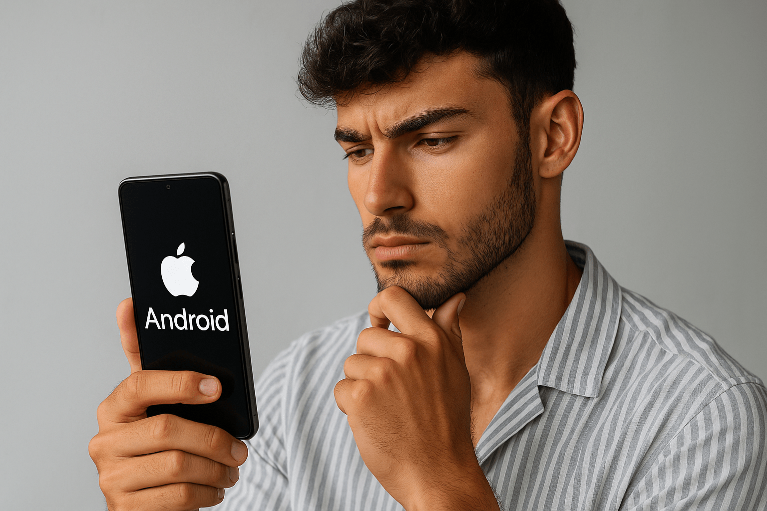
The difference between someone who uses their phone and someone who curates it lies in the details. The way icons float. The translucence of a panel. The softness of an animation that makes a digital surface feel almost alive.
That’s the power of iOS 26’s Liquid Glass aesthetic — a design language that’s clean, adaptive, and deeply tactile. But here’s the secret most people overlook: you can achieve the same visual rhythm on Android, without sacrificing control, speed, or freedom.
This isn’t another “download this app, and you’re done” piece. This is a hands-on transformation guide — for those who actually want to craft their device like a workspace, not a toy.
Understanding the iOS 26 Look — What You’re Really Recreating
Before you start downloading launchers or changing icons, you need to understand what makes iOS 26 look and feel the way it does. It’s not about white icons or minimal fonts. It’s about light, depth, and motion.
Apple’s design team built iOS 26 around the illusion of glass — translucent panels layered over soft gradients and blurred backgrounds. Every screen feels like it’s floating, subtly reflecting light as if viewed through water.
That’s the look you’ll rebuild on Android:
- Translucent cards and control panels
- Rounded corners and floating layers
- Smooth parallax motion
- Dynamic shadows that feel real, not flat
- Subtle haptics synced with UI actions
Android gives you every tool to do it — just scattered in different places. This guide puts them together.
Step 1 — Choosing the Right Launcher (Your Foundation)
Your launcher defines 80% of how your phone feels. It’s your control center — and the first step toward making Android feel like iOS 26.
Below are the strongest options depending on how deep you want to go:
| Launcher | Strength | Why It Works for iOS 26 Look |
|---|---|---|
| Nova Launcher (Prime) | Maximum control | Lets you adjust icon size, label transparency, blur levels, and shadows |
| Niagara Launcher | Minimal and fluid | Focuses on clean navigation with smooth gestures and space between icons |
| Lawnchair Launcher | Free, open, Pixel-based | Feels native, supports adaptive icons and blur effects |
| Launcher iOS 26 | All-in-one mimic | Replicates the full iOS look — icons, control center, animations |
Set your launcher as default, disable your OEM launcher (only if allowed), and start with a neutral wallpaper — nothing flashy yet. You’ll build around it.
Step 2 — Icon Packs, Layers, and Texture
The second most visible element after your layout is your icon set. iOS 26 icons share one visual DNA: frosted softness and rounded unity.
Here’s how to match that on Android:
- Install an iOS-style icon pack from your launcher’s settings (for Nova, use Icon Pack > Select).
- Adjust the icon size to about 115–125% for that full “grid presence.”
- Remove labels entirely or make them 50% transparent.
- Use icon masks to round inconsistent icons automatically.
If your launcher supports blurred dock backgrounds, enable it. It adds that iOS glass panel under your bottom row — one of the most visually recognizable cues of iOS 26.
For a more refined texture, use frosted overlays (apps like KWGT or KLWP let you create transparent glass shapes under widgets). The effect looks subtle but gives your home screen “depth.”
Step 3 — Widgets That Float Like Glass
Widgets in iOS 26 aren’t boxes — they’re glass panels suspended above the background. To replicate this, you’ll need customization apps like KWGT Pro.
Inside KWGT:
- Create a base rectangle with rounded corners.
- Add a Gaussian blur to simulate frosted glass.
- Add your time, date, or weather text above it.
- Keep transparency between 65–80%.
Now anchor your widget off-center — not grid-perfect. The slight offset looks more natural, more “designed.”
If you don’t want to build from scratch, search for glass widget presets for KWGT; most already match the iOS 26 aesthetic perfectly.
Step 4 — Control Center and Notification Shade
The Control Center is what most people recognize instantly as “Apple.” Replicating that in Android isn’t hard if you do it tastefully.
Here’s the hierarchy:
- Overlay Apps
Install a Control Center app that brings the pull-up translucent menu (toggle Wi-Fi, Bluetooth, brightness, etc.). Adjust blur intensity to medium and opacity to around 70%. - Custom Quick Settings Panels
On newer Androids, use apps that allow theme layers on your native notification shade. The goal: a glassy background with clear white toggles floating over it. - Gestures
Map your swipe-up gesture to open your control center. Smooth transitions matter as much as visuals.
If you’re rooted, system overlays can theme your entire notification drawer — blurring the background while keeping text crisp white. That’s as close to iOS 26 realism as it gets.
Step 5 — The Lock Screen Experience
iOS 26 introduced a reimagined lock screen with floating time, adaptive blur, and contextual wallpapers. Android can easily match that when you layer it right.
Use KLCK (Kustom Lock Screen Maker) to build yours:
- Background: your main wallpaper, slightly blurred.
- Foreground: translucent card for clock and notifications.
- Accent: subtle shadow or reflection behind the card.
Pair it with an Always-On Display if your phone supports it. The trick? Keep your clock font slim and confident — never chunky or decorative. Simplicity is power here.
Step 6 — Wallpapers That Feel Alive
iOS 26 wallpapers aren’t static; they breathe. Soft gradients, blurred reflections, and layered hues create movement even when nothing’s happening.
Use live wallpapers that shift perspective slightly when you tilt the phone — the parallax effect adds instant depth.
When choosing or creating a wallpaper:
- Stick to neutrals and glass tones (blue-gray, muted amber, fog white).
- Avoid texture; it ruins the glass illusion.
- Add one gradient source of light, top-left or top-right.
Your goal: background light consistency, not contrast.
Step 7 — Motion and Haptics
This is where 90% of Android setups fail. They copy the look but forget the feel. iOS 26 is motion-coordinated. Everything reacts — subtly.
Motion
Use launcher settings to slow down animations slightly (Nova allows 0.9× to 1.1× range). This creates that buttery glide Apple devices are known for.
If possible, add fade transitions between apps rather than sharp cuts.
Haptics
In your phone’s vibration settings, fine-tune:
- Enable “touch feedback” for key UI elements.
- Reduce intensity so it feels like a tap, not a buzz.
- Sync light haptics with navigation gestures.
When combined, these micro-details make the phone feel engineered, not themed.
Step 8 — Fine-Tuning the System Look
For users comfortable exploring deeper settings, theme engines like Substratum or OEM theme stores can apply translucent backgrounds across menus, app drawers, and settings screens.
Checklist for finishing touches:
- Rounded corners for pop-ups and dialogs
- Transparent nav and status bars
- Unified color palette: whites, grays, transparent overlays
- Soft blur behind menus
Avoid bright accent colors. The more consistent the visual rhythm, the more premium the final result.
Step 9 — Balancing Power and Performance
The glass aesthetic uses live blurs, shadows, and transparency — which means GPU load. If your phone lags or heats up:
- Lower blur radius in overlays
- Reduce animation scales slightly
- Use static wallpapers instead of live ones
The trick is balance. You want fluidity, not frame drops. On mid-range phones, you can achieve 90% of the iOS 26 look without maxing out transparency settings.
Step 10 — Living With the Setup
This setup isn’t just for screenshots. It’s meant to live with you daily. That means considering usability, readability, and battery impact.
A few practical rules:
- Always test widget legibility in both dark and light environments.
- Avoid “white on white” transparency; contrast should stay functional.
- Revisit your setup after a week — trim what feels unnecessary.
A good interface disappears. You shouldn’t have to think about it.
When You Shouldn’t Do This
This might surprise you — not everyone should convert their phone this way.
If your device is a budget model with limited graphics capabilities, avoid full blur overlays and live wallpapers.
If you prioritize battery longevity over aesthetics, skip parallax and haptic sync.
Customization is art, but practicality always wins. You want beauty that performs, not beauty that drains.
The Gear You’ll Rely On
| Category | Recommended Tools | Purpose |
|---|---|---|
| Launcher | Nova Launcher Prime, Lawnchair, iOS 26 Launcher | Core customization layer |
| Widgets | KWGT Pro, Glass KWGT Pack | Floating, glassy elements |
| Lock Screen | KLCK | Rebuild the iOS 26-style translucent lock screen |
| Overlays | Substratum Theme Engine, Power Shade | System-wide transparency |
| Wallpapers | Dynamic or Parallax Wallpapers | Adds motion depth |
| Haptics & Motion | Launcher animation settings, system feedback tuning | Makes the UI feel right |
Each tool works better on newer Android versions (Android 13 and above). Always test one tweak at a time instead of stacking too many at once.
Why This Matters
Most users think aesthetics are vanity. But personalization is psychology. When your environment — physical or digital — feels refined, you operate differently.
A glassy interface reflects precision. Clean gradients calm the mind. Consistent design teaches focus. It’s not about copying Apple; it’s about discipline through design.
That’s what the MenVice mindset is about — refining what you already have, not chasing what others flaunt.
Before You Leave
This transformation is your chance to build a personal aesthetic — one that blends Apple’s restraint with Android’s freedom. If you go through this setup, share your screenshots and tweaks in the comments below.
Tell us what combination worked best for your device, or what other aesthetic you’d want us to break down next.
And if this kind of gear-meets-design content speaks to you, subscribe to our newsletter — it’s where we drop full visual build guides and design setups before they go live here.
